PPG/Glidden® Color Brochure Concepts
Project Background
This was a group project by the PPG DIY In-House Design team: Kevin Hilliker (Creative Director), Maria Puwalowski (Designer), Nikki Johnson (Designer) and Lori Haramia (Designer). As a group, we ideated together and formed three separate pathways of design and communication to present to Marketing. Individually, we divided the design work by pathway—each of the three designers to create two concepts for a pathway—I chose to work on “Leader”.
Project Principals
“The new PPG/Glidden color program at THD is fresh and modern, understanding the color needs of today’s design-enthusiastic consumer.
The palette is a mix of art and science—offering the most popular, classic, and forecasted colors in logical let-down stripe cards for easy color selection.
Color is universal—yet personal, authentic, and approachable.
ACTIONABLE INSPIRATION
Language and imagery that give consumers confidence
Making the language very straight forward to reassure consumers they are making the “right” choice.
INSPIRATIONAL BUT APPROACHABLE/AFFORABLE/ACHEIVABLE
We want consumers to feel confident, knowledgeable, and motivated after reviewing the brochure
VOICE
The Voice should exude our color expertise without being too high level and losing the achievable motivation” —Kevin Hilliker

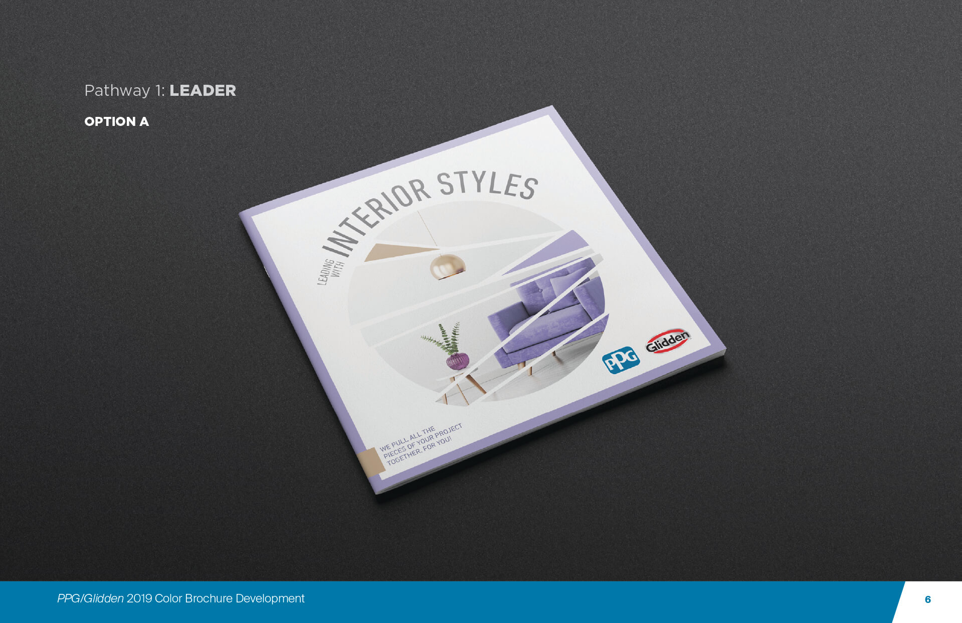
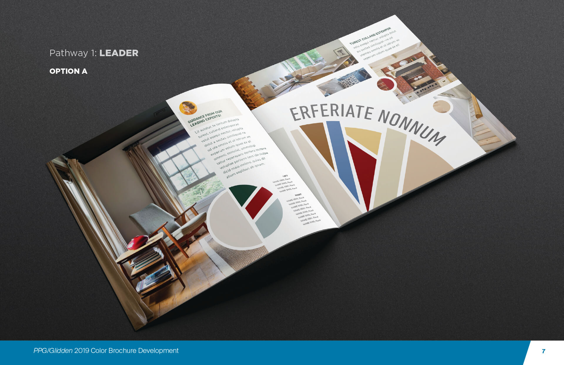
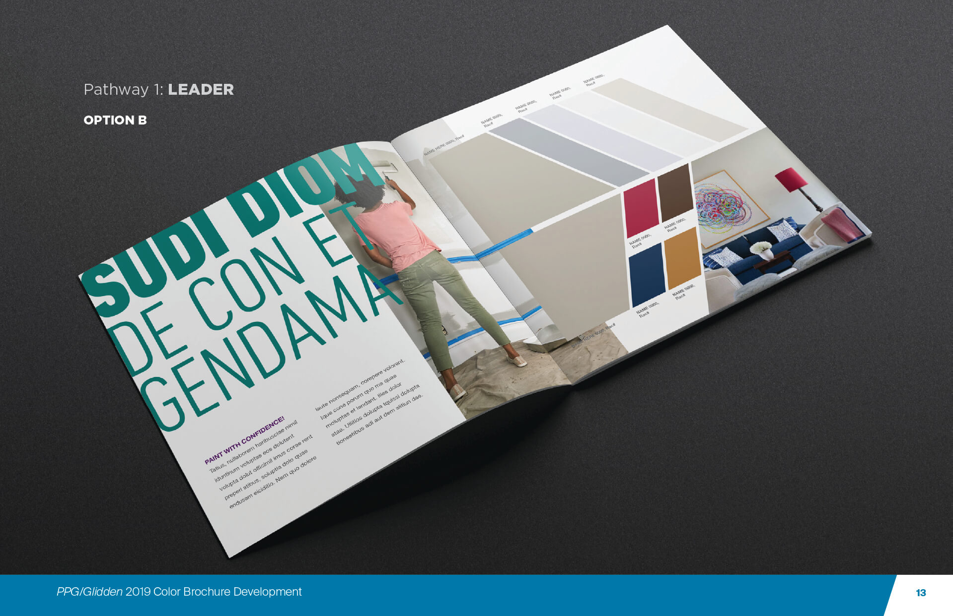
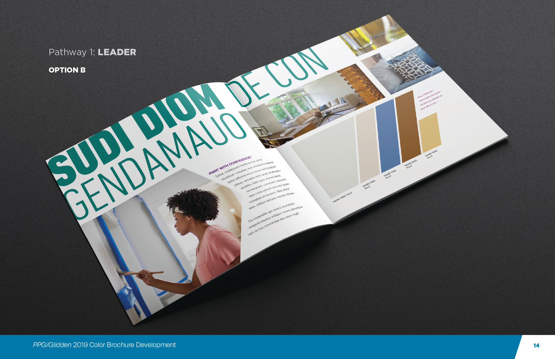
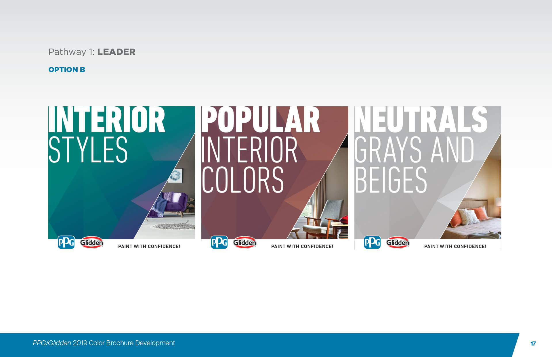
Pathway 1: LEADER
Option A
Designed by Maria Puwalowski


Option B
Designed by Maria Puwalowski

Overview of All Options Presented

